


🎨 Vibe Month: cover art maketh a podcast
Making sure your cover art aligns with your podcast


Hi hi! I’m back from The Podcast Show in London but I wish I was still with my colleagues and friends. I mean, look at us –
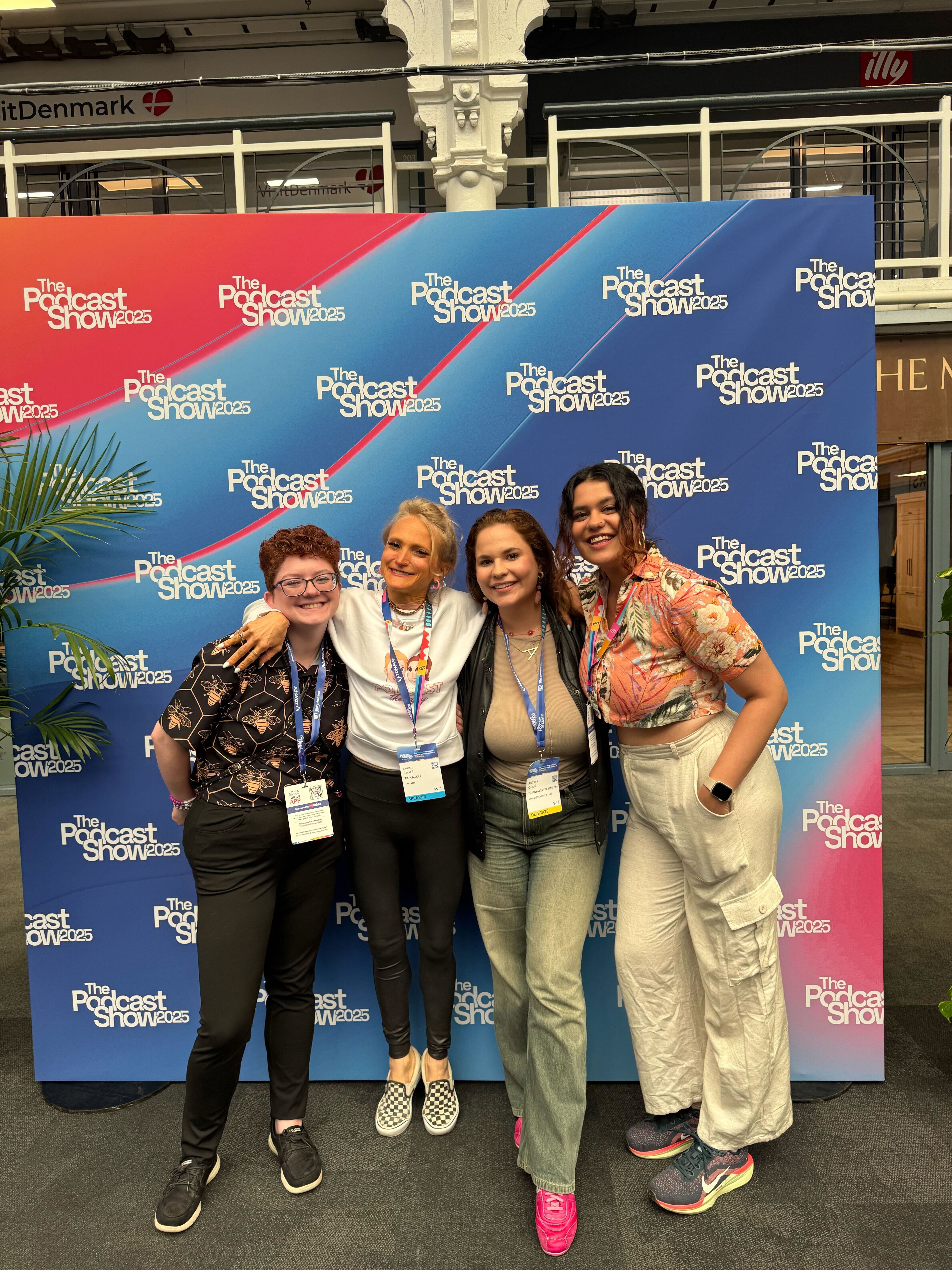
Sigh. But, back to reality we go!
Now, I can speak for me (and I suspect many of you) when I say that – I do judge a podcast by its cover art. That’s why, we have the wonderful
concluding our Vibe Month with a fantastic issue on cover art. Take it away, Arielle!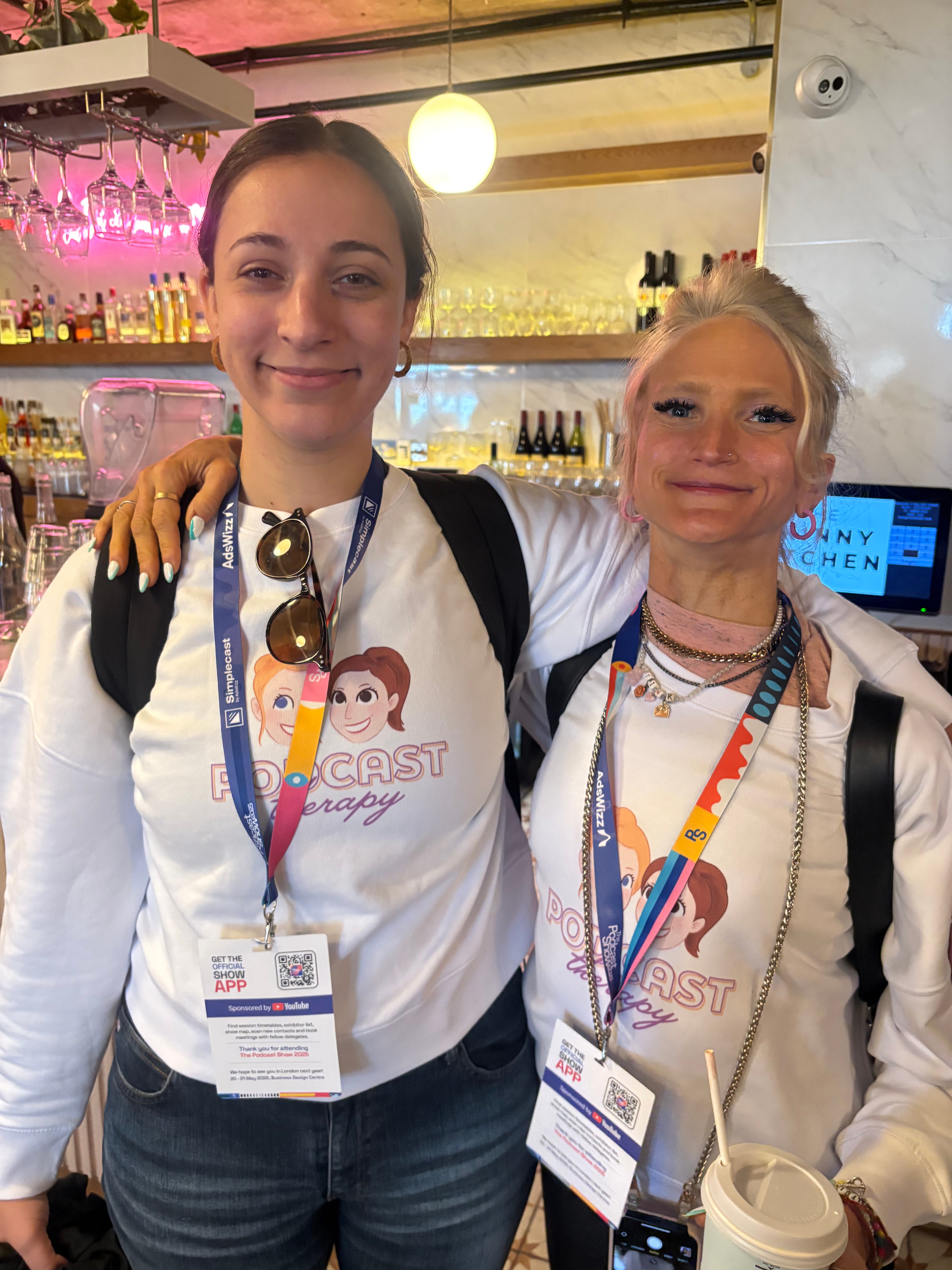
Arielle Nissenblatt here, checking into the Vibes Hotel during Vibe Month at Podcast Marketing Magic. And I’ve brought with me my thoughts, feelings, and practical tips on making podcast cover art.
🟡 If you only have time for one thing:
Whether you’re in the stage of revamping your cover art or it’s been in the world for a while, send it to a friend (and an enemy) who hasn’t seen it before. Ask them, “what do you think this show is about based on the cover art alone?” Ask them to share the tones, themes, and ideas it evokes. Then evaluate. Are they on track? Or do you need to reassess the vibes your cover art is giving?
🥾 Put yourself in your listener’s shoes
First, I ask you to reflect.
Think of the last podcast you subscribed to. What was your first impression of it? You probably heard the name of it from a friend or saw the cover art on your podcast listening app of choice. What then caused you to hit play? And then, what was it about the show that kept you coming back?
If you’re discovering a show for the first time, the artwork that represents it is doing a lot of work to either draw you in or turn you away – whether we realize it or not.
The bottom line is that we want to make a promise to our listeners and then consistently deliver upon that promise.
🎢 The onramp experience
When someone is discovering your show for the first time, there’s a lot going on in their head that they’re not necessarily aware of. And while you can’t control what they think of your show or how they interpret your words, interviews, or takeaways, you can guide them.
This is where the listener onramp comes into play. There are a few elements that make up an onramp experience for a potential listener:
The Name of the Show
Does the name clearly convey what I’ll be getting from the show? If not, is there some sort of tagline that further explains? Or does the artwork do a lot of the heavy lifting when it comes to the content of the show?
Is this of interest to me? If so, I’ll go to the next step.
The Artwork
Is the artwork inviting, bright, and/or descriptive? Or, is it purposefully not any of those three things? Either way, is it setting me up to get a sense of what awaits when I hit play?
Is this of interest to me? If so, I’ll go to the next step.
The Trailer
Is the trailer of the show a. marked as a trailer on your hosting provider, b. reflective of the tone, scope, and content that a listener will find within the rest of the show, and c. of similar quality to the rest of the show?
Is this of interest to me? If so, I’ll go to the next step.
The First 30-seconds of the First Available Episode
Do all of the prior onramp elements match this? As a unit, are they vibing? (Shoutout Vibe Month).
If so, I’ll go to the next step.
You’re providing your would-be listener with an onramp that eases them into your show. But you can only do so much. So even if you hit all of the above head on, you can always lose a listener for other reasons. But let’s control what we can control.
🧪 Practical elements of making great cover art
In 2021, I attended a podcast cover art talk by Alban Brooke, head of marketing at Buzzsprout, at Podcast Movement. He mentioned something that stuck with me.
We’re taught as kids, “don’t judge a book by its cover.” Great, noble, aspirational. And it makes sense when we’re talking about people. And it made sense when we were talking about books in the days of yore – all books sat on shelves with their spines out and looked the same. If we judged them by their covers, we’d never know anything about what’s within. But now, we do and we should judge books on their covers. And, you see where I’m going here, podcast covers as well.
➡️ All podcast cover art has to be:
A minimum of 1400x1400 pixels and a maximum of 3000x3000 pixels
It should be in JPEG or PNG format, 72 dpi, and in the RGB color space
The recommended size for both Apple Podcasts and Spotify is 3000x3000 pixels
Remember that you can also design episode specific artwork! That’s just a bonus, but follows some of the conventions we’ve shared and will share in this article.
Once you’ve got those requirements out of the way, that’s when personalization comes in.
🏆 Golden rules for personalization
Here are some of my guiding principles when it comes to personalizing your artwork and taking advantage of the opportunity to draw in your potential listeners:
Cover art is most likely to be seen from far away, so potential listeners won’t be able to zoom into every detail. Keep it simple.
There’s no hard and fast rule for whether or not you should put your face on your cover art.
It’s really a case by case situation. Leave us a comment on this post if you have questions about your specific artwork. Or book a Podcast Therapy session with us.
Once you establish your cover art’s color scheme and font choices, those elements should be present in other visual representations you make for your show going forward such as social posts, website…etc.
Of course, you can switch things up! And, you can have different shades to denote different seasons and other occasions. But, if you’re not a professional designer and only have the money to hire someone for this initial design round, stick with the initial bullet point.
Your artwork isn’t set in stone! You change it up when a new season drops, when you bring on a different co-host, or when you update your tagline. You can also slap a logo on there to sweeten the deal for a sponsor. Anything you can imagine, you can try. Just refer back to my point on transparency and explanation to make sure you gain and maintain your listeners’ trust.
👯 Vibe Matching
Packaging your podcast all goes back to expectation setting and delivery.
Your artwork doesn’t have to be perfect. Your trailer doesn’t have to sound impeccable. Your show can be a work in progress. But the vibes should match throughout. And it starts with your cover art – the first thing they see.
What to do today:
✅ Get feedback
Share your existing artwork with a friend (and an enemy) who isn’t familiar with your show. Ask them to share what they think it’s about. There are no wrong answers. Don’t steer them in any direction.
✅ Look at your podcast’s category
Go to your show’s category charts on Apple and Spotify (and Pocket Casts, Overcast, Goodpods, Castbox…etc) and start noticing trends, colors, and fonts. Do you want to stand out or fit in or land somewhere in between? Check back regularly.
✅ Look at non-podcast media artwork in your industry
If you host a podcast about beluga whales and marine biology, you should definitely be aware of the other beluga whale / marine biology podcasts out there but you should also check in with beluga whale influencers, newsletters, meme accounts, and more.
On those platforms, what trends are you seeing? How do you want to be in concert with them or in opposition?
📝 Resources
I’ve linked to a few cover art and packaging resources throughout this article, but here I am with a recap of ‘em:
Apple recently announced a partnership with Canva to design artwork. This makes things A LOT easier for many amateur designers who didn’t necessarily have access to Photoshop.
I used to post a lot about cover art on Twitter (RIP), and I think this was a helpful exercise
It’s really up to you whether or not you include your headshot in your cover art. But please, no mics, headphones, or other elements that scream “THIS IS A PODCAST.” We know! More on that here.
A lot of folks use the two terms interchangeably, but Lower Street clarifies the difference between a podcast logo and podcast cover art.
Try these templates I made on Canva if you’re stuck on how to get started.
Thanks, Arielle! Better bookmark this one, kids. It’s got a LOT for you to keep coming back to.
🌟 More Magic:
On June 3, Lauren and I are hosting a Radio Boot Camp on growing your podcast with the very elusive perfect ad spend.
Tiny Human Things is what audio is all about to me. It’ll change the way you look at butterflies, rainbows, and all the little things that bring us joy. It’s a new podcast about how our smallest universal pleasures can reveal some big, surprising truths about humanity.
Ayo Oti of Sounds Like Impact has launched Empact Exchange – a movement and community space for people creating and seeking mission-driven audio.
Our dear Pocket Casts has launched a newsletter! Subscribe to keep up with their curation opportunities and more.
🌏 From the Desk of Tink

What If We Get It Right is a podcast we’re proud to be working with. Hosted by climate activist and wonderful human Dr. Ayana Elizabeth Johnson, this podcast invites guests to converse with about climate change and making solutions a reality. What makes it stand out from other climate shows? The optimistic and wholesome nature of the conversation. It’s a delight to not have climate change be accompanied by doom and gloom for once. [Full disclosure – I’m writing this even as I listen to Ayana on The Sam Sanders Show and am blinded by my own tears].
Thank you for reading today! Next week, we kick off Data Month here at Podcast Marketing Magic.
Until then, stay curious,
💜 Shreya
Thanks for having me! I <3 Vibe Month.